MUSEPOD
Website Design
UX/UI DesignAdobe XD; WIX
MUSEPOD website is built as a part of the company’s brand development project. I am in charge of competitive analysis, information architecture and UI/UX design.
GOAL
Convey company vision and mission
Communicate brand and product features
Secting company services
Archive company accomplishments
Communicate brand and product features
Secting company services
Archive company accomplishments
PROCESS
︎︎︎ Competitive Analysis
︎︎︎ Information Architecutre - Site map
︎︎︎ Prototyping
︎︎︎ Information Architecutre - Site map
︎︎︎ Prototyping
OUTCOME
Significantly increase the efficiency of point-to-point client communication with digitally compiled company pr information.
01
RESEARCH & INSIGHTS
Competitive Analysis
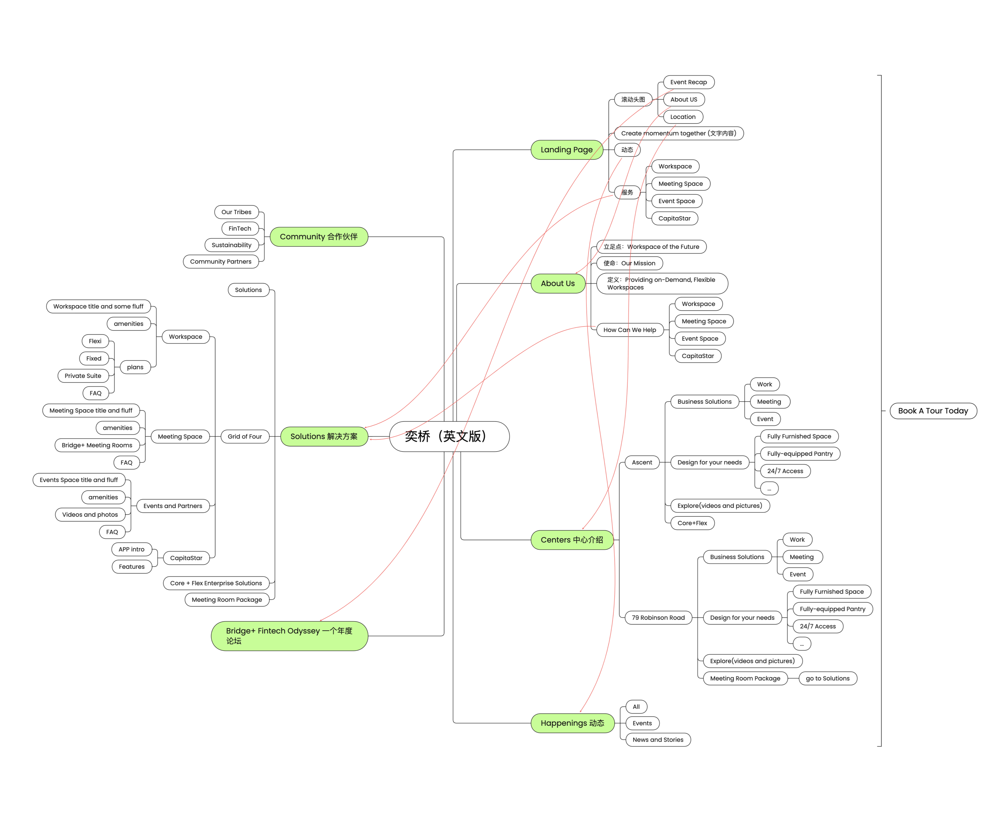
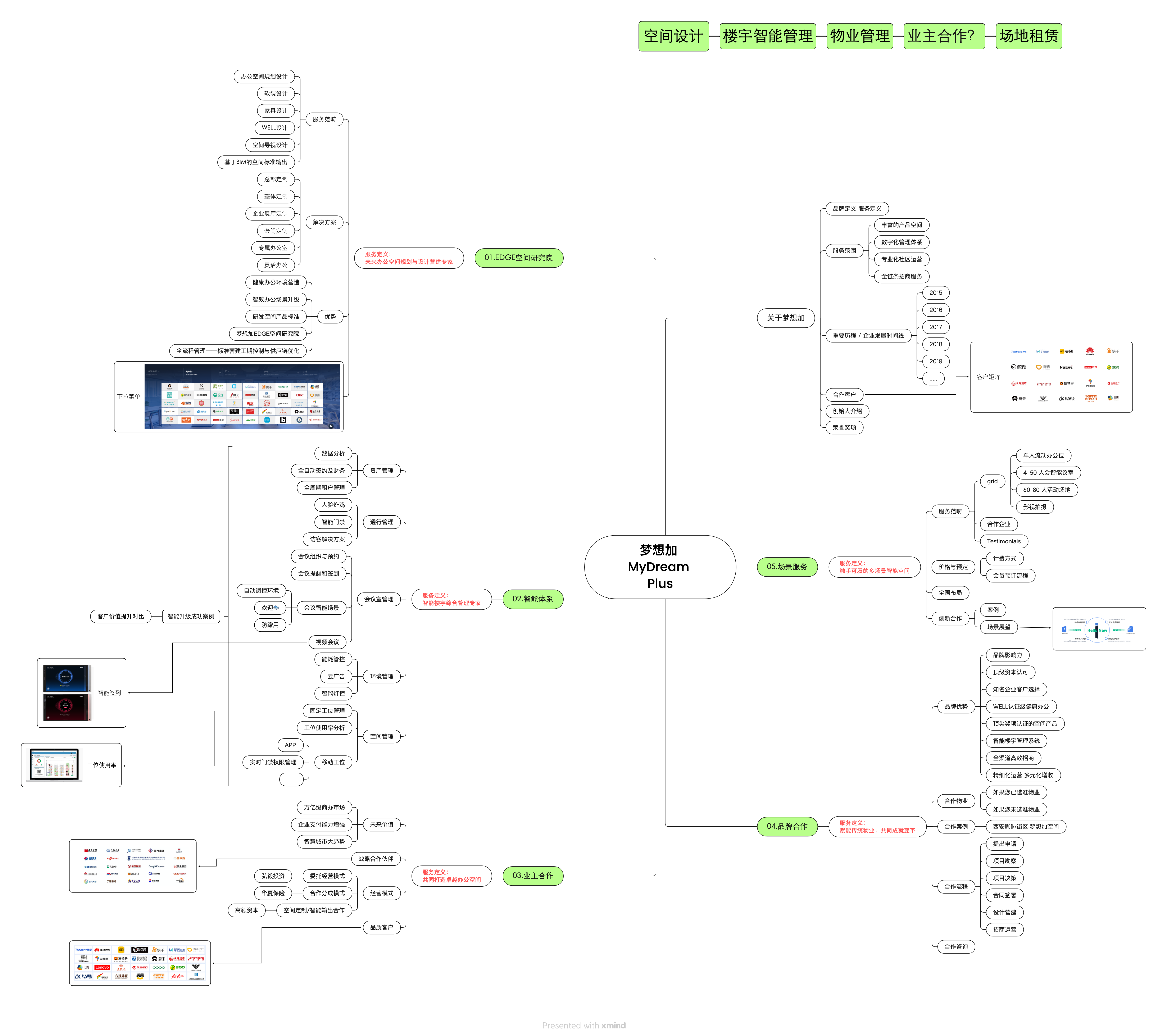
Competitive analysis was done based on a series of UX audits of competitors and reference websites. We examined the logic flow, user experience, and overall personality of over 10 websites.
︎Room ︎Bridge+
︎framery ︎MyDream Plus
Competitive analysis was done based on a series of UX audits of competitors and reference websites. We examined the logic flow, user experience, and overall personality of over 10 websites.
︎Room ︎Bridge+
︎framery ︎MyDream Plus
02
INFORMATION ARCHITECTURE
I build MUSEPOD’s information architecture after UX audit and analysis. We focused on showcasing the company’s expansive service sectors.

03
PROTOTYPE
Three major prototypes were developed after the information architecture was finalized ( there was one more prototype developed based on an earlier version of info architect). First prototye was built in Adobe XD with the branding personality and filler text. The second prototype was built on WIX and was put in market. The third prototype updated the landing page and navigation bar to better convey the company’s brand story.
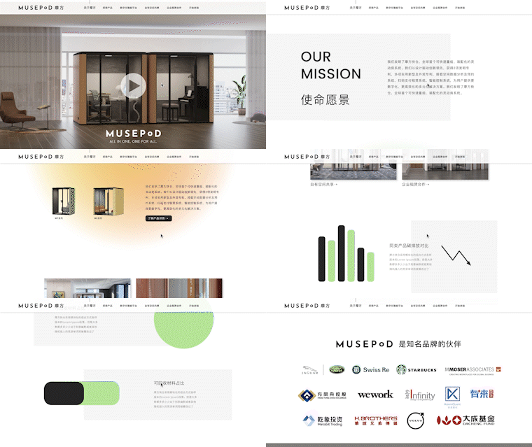
Mid-Fidelity Prototype
The initial prototype was build via Adobe XD. I reached mid-fidelity for the first prototype to better visualize the personality and of the website for the client.
The initial prototype was build via Adobe XD. I reached mid-fidelity for the first prototype to better visualize the personality and of the website for the client.

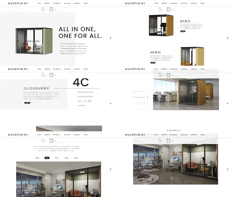
High-Fidelity Prototype
High-fidelity prototype is realized through WIX. This version was running in the market before the last prototype update on the landing page.
Product Series Page
Communicate product core competancies
Showcase product customization
Display major technology features
Service Sector Page (Rental)
Communicate service details
Showcase relevant cases
Call-to-action
LandingPage/
Navigation Update
The landing page and navigation was updated as required by client.
Navigation Update
The landing page and navigation was updated as required by client.
Other
Experimentation
Musepod is a powerful office pod system that allows great level of customization. To showcase this feature, I developed a few interfaces. This was not realized due to technical difficulties.
Experimentation
Musepod is a powerful office pod system that allows great level of customization. To showcase this feature, I developed a few interfaces. This was not realized due to technical difficulties.
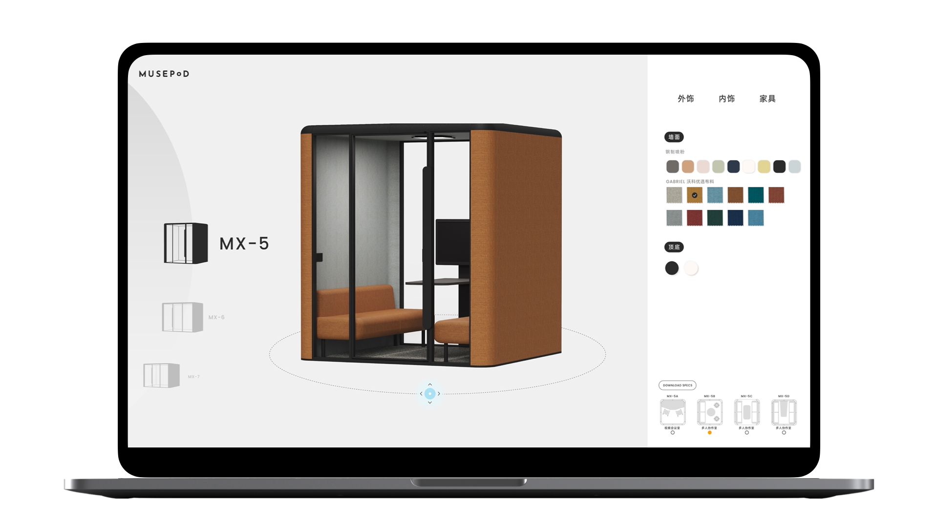
Variation Swatch

Draggable Objects Interaction
