
UX AUDIT Rome2Rio
UX/UI DesignInvision; Adobe Illustrator
Rome2Rio is a searching platform allows users to compare and contrast different transportation methods. Especially useful for Europe where point-to-point transportation comes with sea-land-air options and combinations.
Because of the diversity of searching result, bookings cannot be completed within the app, but at carrier’s website. This lead to a low user stickiness. The redesign aims provide a complete experience from searching to booking within the app to increase overall user experience and loyalty.
Because of the diversity of searching result, bookings cannot be completed within the app, but at carrier’s website. This lead to a low user stickiness. The redesign aims provide a complete experience from searching to booking within the app to increase overall user experience and loyalty.
GOAL
Pinpoint not-yet-perfect areas of a digital product. Based on key insights, propose a new feature with focus on user needs.
PROCESS
︎︎︎Screen to Screen Analysis
︎︎︎ User Interview
︎︎︎ Competitive Analysis
︎︎︎User Flow
︎︎︎Prototyping
︎︎︎ User Interview
︎︎︎ Competitive Analysis
︎︎︎User Flow
︎︎︎Prototyping
OUTCOME
Lifted user experience that allows user to enjoy an one-stop service from searching to booking their cross country transportation with maximized mix-and-match sea-land-air options.
01
UX AUDIT
Problem Shooting:
︎Searching
︎Booking
︎Documenting
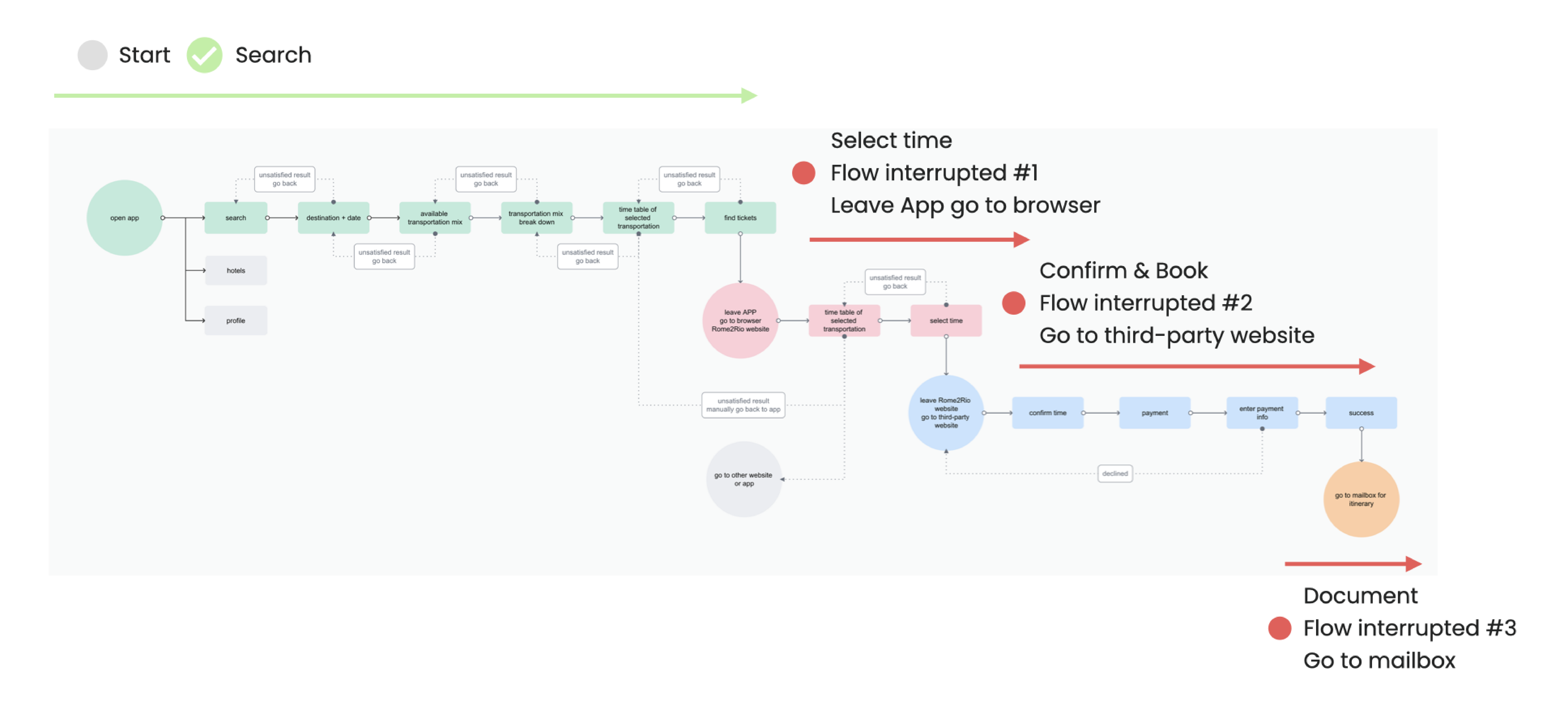
1. Fractured userflow:
- app to browser
- R2R webpage to carrier webpage
2. Scattered itinerary
UX AUDIT
Problem Shooting:
︎Searching
︎Booking
︎Documenting
1. Fractured userflow:
- app to browser
- R2R webpage to carrier webpage
2. Scattered itinerary
02
RESEARCH & INSIGHTS
User Interviews
Key Insights: ADHD Unfriendly
Key Insights: ADHD Unfriendly
“
Jump around searching platforms
“ Scattered itinerary
“ Organize information
“ Focus on tasks; Easily distracted
“ Organize and remember information
“ Start over the search when distracted
“ Scattered itinerary
“ Organize information
“ Focus on tasks; Easily distracted
“ Organize and remember information
“ Start over the search when distracted
Competitive Analysis
Competitive analysis aims to examine the in-app booking experience of a few transportation searching platforms including expedia, kayak, fliggy travel and etc.
Competitive analysis aims to examine the in-app booking experience of a few transportation searching platforms including expedia, kayak, fliggy travel and etc.

Expedia
︎Searching
︎Booking
︎Documenting
︎Searching
︎Booking
︎Documenting


Kayak
︎Searching
︎Booking
︎Documenting
In-app transfer to carrier webpage
Automatic and manual itnerary import
︎Searching
︎Booking
︎Documenting
In-app transfer to carrier webpage
Automatic and manual itnerary import
Fliggy Travel
︎Searching
︎Booking
︎Documenting
︎Searching
︎Booking
︎Documenting

03
IMPROVEMENT GOAL
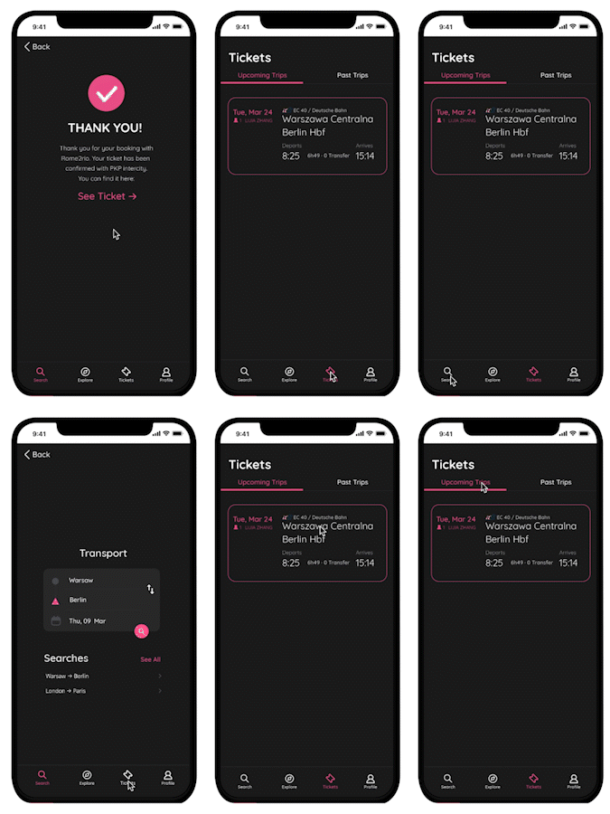
A linear in-app experience from search and book, and make sure itineraries are readily available in app; avoid fractured userflow.
1. One-stop booking experience
2. Compiled itinerary
IMPROVEMENT GOAL
A linear in-app experience from search and book, and make sure itineraries are readily available in app; avoid fractured userflow.
1. One-stop booking experience
2. Compiled itinerary

︎︎︎

04
PROTOTYPE
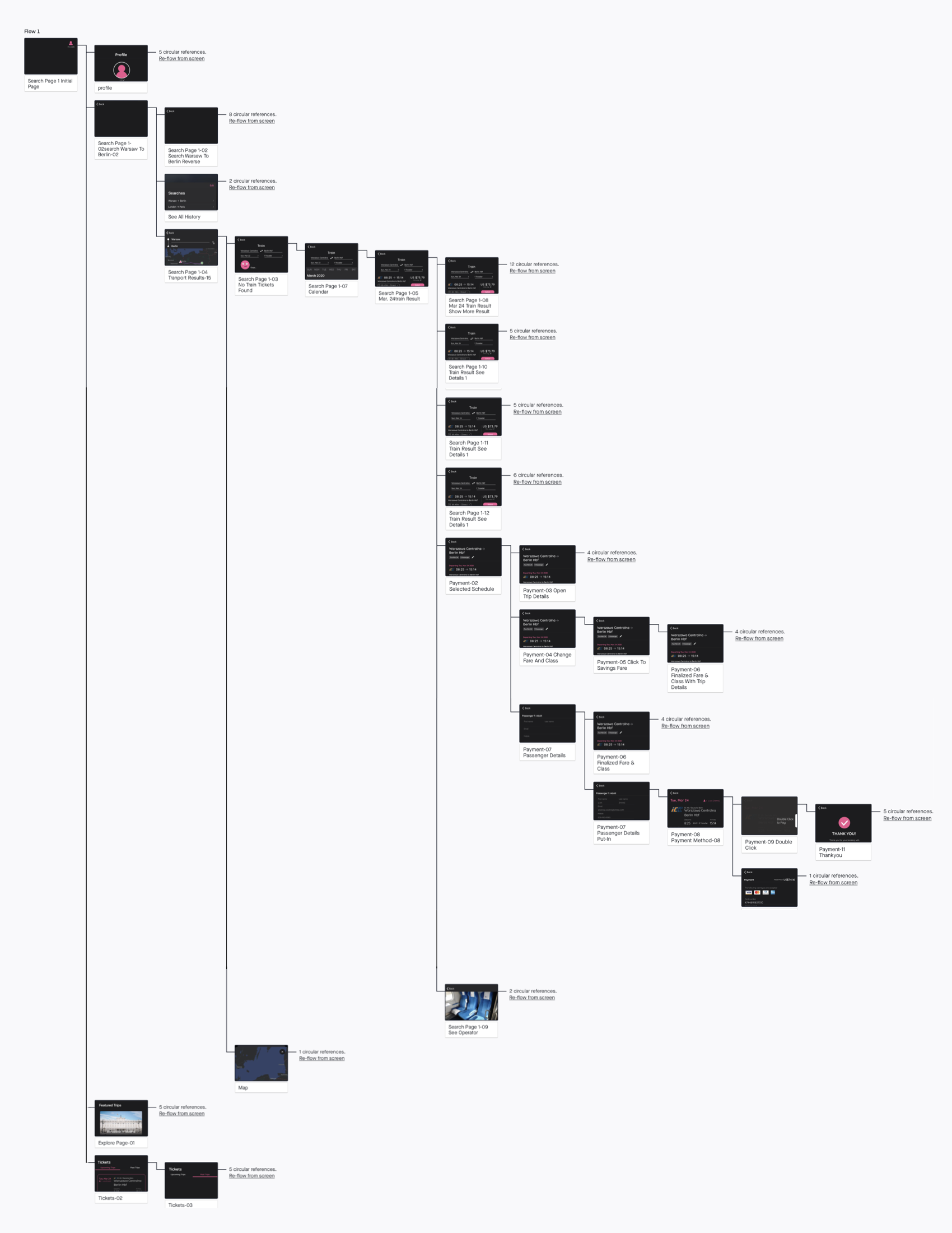
To create a complete booking experience, carrier webpage is stiched to the original app user flow.
PROTOTYPE
To create a complete booking experience, carrier webpage is stiched to the original app user flow.
Flow View
![]()
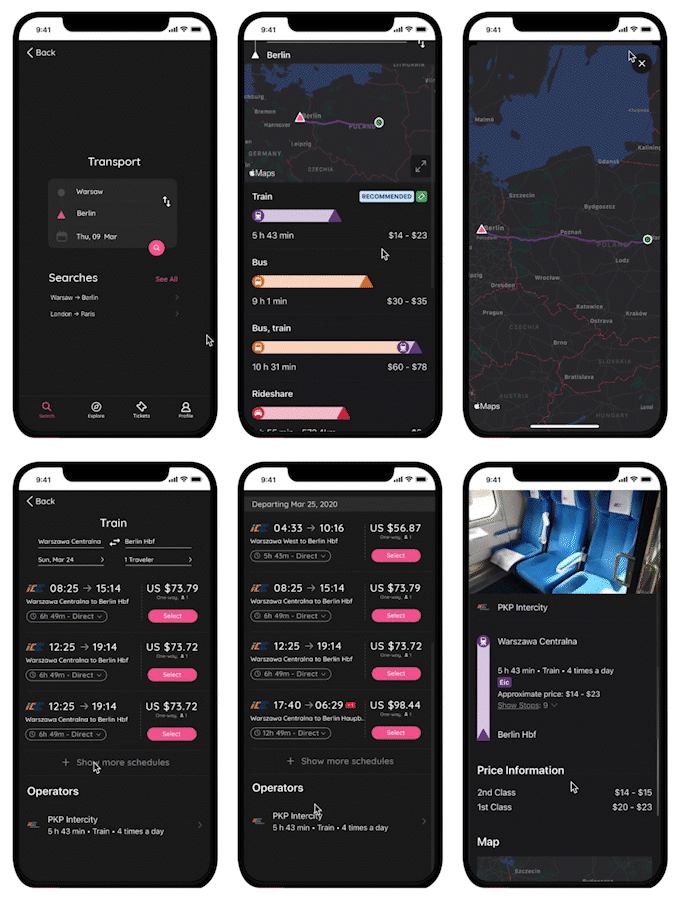
︎In-App Searching
︎In-App Booking
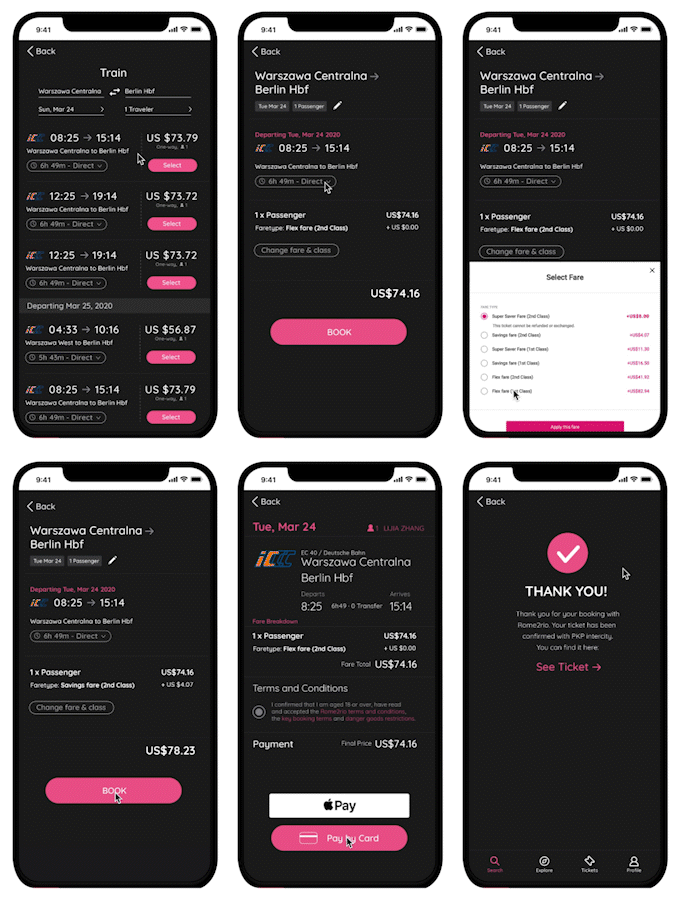
︎In-App Documenting
Final Documentation